How I Created a Complete Restaurant Identity: The Adriano Case Study
Every restaurant tells a story through its food. But the impression begins before the first dish — the moment a guest picks up the menu.
When Adriano Restaurant & Cafe reached out to me, they didn't just need a menu design. They needed a complete visual identity that would carry their Mediterranean soul — from menu pages to business cards, from flyers to the overall brand feeling.
In this case study, I'll show how I built a cohesive identity for two Adriano locations: Trenčín (Slovakia) and St. Michael (Austria). One brand — different execution.
How It All Started
The client came to me through a recommendation. They had already seen my work through mutual contacts and decided to reach out to discuss a possible collaboration.
The initial request was specific: a logo for a new Adriano restaurant opening on a golf course in Austria. The same owner was expanding the brand to a new country, and they wanted the logo to reflect the golf course atmosphere while staying true to the existing Adriano identity. The color palette, aesthetic decisions, and overall mood had to remain consistent with the established brand.
The timeline was extremely tight. Every stage — from discussion to the final version — was completed within just a few days.

Finding the Visual Direction
I presented three different concepts to the client: a classic approach, a bright and atmospheric style, and a light sketch-based direction — casual and relaxed, perfect for a restaurant on a golf course.
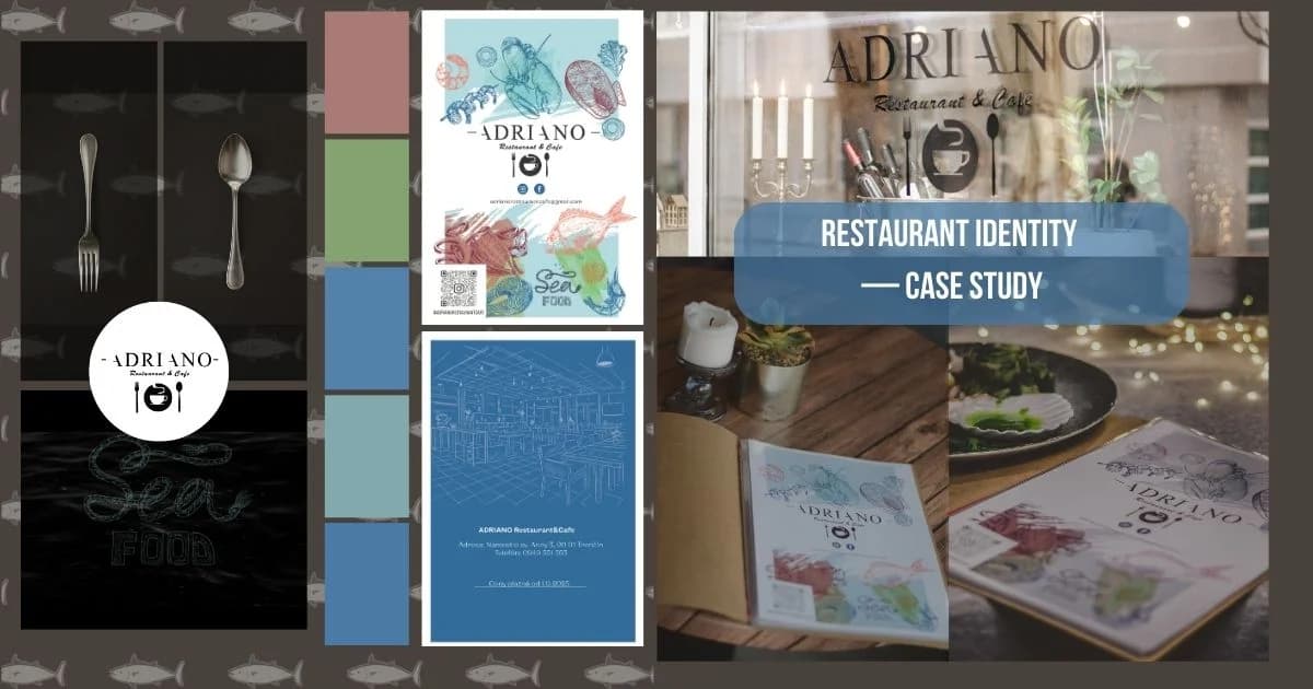
The sketch style was chosen for the Austria location. But then something interesting happened: the Trenčín restaurant saw the new designs and requested a complete rebrand of their own. That's how the watercolor seafood concept was born — detailed hand-drawn illustrations that became the visual anchor of the entire Trenčín identity.
The core idea — hand-drawn seafood illustrations on a light, airy background — feels like pages from a naturalist's sketchbook. I chose a watercolor approach with detailed line work: lobsters, fish, oysters, shrimp — each drawn individually, then composed into page layouts. The color palette combines cool blues and warm terracotta, reflecting the sea and Mediterranean sunshine.

Hand-Drawn Illustrations
Each illustration in the menu was drawn by hand, then refined and placed into the layout. The seafood illustrations aren't just decoration — they're the visual anchor of the entire brand.
For this project, I created around nine individual seafood illustrations plus one full background illustration. I also designed a separate Sea Food logo — a stylized lettering executed in a rope-knot style to emphasize the maritime theme and add character to the brand.
The process started in the most organic way possible: the first sketch was literally born on a napkin — it helped quickly capture the idea. Then I created a more detailed hand-drawn sketch before moving to the final rendering in Adobe Illustrator, where the illustrations gained clean lines, color depth, and technical readiness for different formats.
The illustration and layout work took about two weeks. After that, another week was dedicated to fine-tuning details based on client feedback.
The biggest challenge wasn't any single illustration but the technical side: the final file became very heavy due to the number of individual illustrations. The client needed two versions — a full-quality file for the print shop and a lightweight version for the website and social media. Optimizing without losing quality required extra time and careful work with each element.


Menu Design — Page by Page
Trenčín: The Watercolor Seafood Menu
The Trenčín menu consists of 11 pages, each with its own illustration composition:
- Cover: Adriano logo surrounded by seafood illustrations
- Interior pages: dish categories separated by illustrated headers
- Back cover: contacts, social media, QR code
Typography plays a key role: dish names in an elegant serif font, prices in a clean readable typeface, descriptions in a warm sans-serif. The hierarchy naturally guides the eye from name to price to description.


Austria: Light Sketches for the Golf Course Restaurant
The Austria menu follows a completely different artistic approach. While Trenčín got detailed watercolor seafood, the Austria restaurant — the same owner's second location on a golf course — received a lighter, more relaxed design with delicate sketch illustrations. Every page was decorated with light, effortless sketch drawings that perfectly matched the casual golf course dining atmosphere.
The 8-page menu features German text with a slightly different layout adapted for German typography, but the overall brand feeling remains unmistakably Adriano.


More Than a Menu — Complete Brand Identity
A restaurant identity doesn't end with the menu. For Adriano, I also developed:
- Flyers for seasonal events and promotions
- Gift certificates in the brand's illustration style
- Social media visuals — templates and posts maintaining brand consistency
After the successful menu launch, the client entrusted me with managing the restaurant's social media. I started creating posts and visual templates in the brand style to maintain a consistent visual language and boost recognition online.
The results spoke for themselves: within just two weeks of branded posts, the restaurant's page had already reached 23,000 views. The client was delighted, and our collaboration continues.
The real test of any identity is recognition. When a guest sees the menu, then a business card, then an Instagram post — they should instantly recognize the same restaurant. Hand-drawn illustrations create this thread of recognition at every touchpoint.


The Result
What started as a logo for a golf course restaurant became a complete visual identity for two Adriano locations in two countries. The project includes:
- 19 pages of menus (11 Trenčín + 8 Austria)
- 9+ hand-drawn seafood illustrations plus a custom Sea Food rope-style logo
- Flyers, gift certificates, and social media materials
- A unified identity from Slovakia to Austria
- Ongoing Instagram management with 23,000+ views in the first two weeks
This is what I love about restaurant projects: design becomes part of the dining experience. Every guest who opens the menu interacts with my illustrations. That's the kind of work that makes design meaningful.

Ready to Create Your Restaurant's Identity?
Planning to open a restaurant or refresh your existing brand? I create complete visual identities — from menus and business cards to signage and social media templates. Every project begins with understanding your story.
Want to work together?
I'm available for children's book illustration, branding, and visual design projects.
View Services